UCL Report & Support
Evaluating the user experience of a university's reporting platform.
Role 👨🏻💻
UX Evaluator
Team 👥
Me + 2 UX Evaluators
Location 📍
London, UK
Duration 🕒
2 months
(Jul‑Aug '21)
Project 💻
Internship
Skills 🔧
User Research
Information Architecture
Background
University College London (UCL) is a top university in the UK that is continually striving to advance equality, diversity and inclusion for staff and students.
In fact, UCL was the first university in England to welcome women on equal terms with men and to admit students of all religions!
The Problem
The university has a Report and Support (R&S) platform that allows students and staff to report incidents of bullying, harassment and misconduct, or contact advisors for support.
However, the team have received feedback that the website (front-end) is confusing and hard to navigate, and that the case management system (back-end) is difficult to use.
The Goal
Evaluate the user experience of both the website (front-end) and the case management system (back-end) of the platform.
My Role
As a UX Evaluator, I conducted user research with students and staff, defined the usability and information architecture issues, and presented design ideas in a research report.
1. Empathise
Front-End
To evaluate the website, we conducted user research with 12 students who were a mix of undergraduate and postgraduate students of different genders, ethnicities and nationalities.
At the start of the session, participants were presented with a usability test. In particular, they were given a fictional scenario and asked to think-aloud as they (1) reported the incident and (2) found relevant information to get support.
After the usability test, we conducted an open card sort to evaluate the information architecture of the support pages. We asked users to sort articles on the website into groups and come up with their own names for the categories.
Finally, we ended the session with a semi-structured interview. We asked participants to elaborate on how they made some certain decisions during the usability test and card sort and to provide additional feedback on the reporting platform.
Back-End
To evaluate the case management system, we conducted user research with 5 UCL staff. There were 2 administrators (responsible for managing and assigning reports), 1 responder (responsible for following up and providing support to relevant parties), 1 analyst (responsible for tracking the analytics of the reporting platform), and 1 general manager.
Firstly, participants were presented with a usability test. More specifically, they were asked to perform a task that they usually do on the case management system while verbalising their thoughts.
Secondly, we followed up with a semi-structured interview, asking participants to elaborate further on their decisions and provide additional insights.
In addition, we also conducted a survey with 18 additional staff who used the case management system for various purposes. They were asked to rate their experience with the platform, share what they liked or disliked about the platform, and provide suggestions on how the platform could be improved.
2. Define
Front-End Limitations
- Reporting Incidents:
- Users were not provided with enough information to help them make an informed decision on whether they should report anonymously or to provide their contact details.
- Users were confused by the terminology in some questions of the reporting form.
- Users found it difficult to navigate to different sections of the reporting form.
- Getting Support:
- Users were confused by the categorisation of the pages in the Support section.
- Many pages had confusing titles that did not reflect the content of the article.
- Users were overwhelmed by the huge amount of text on some of the pages.
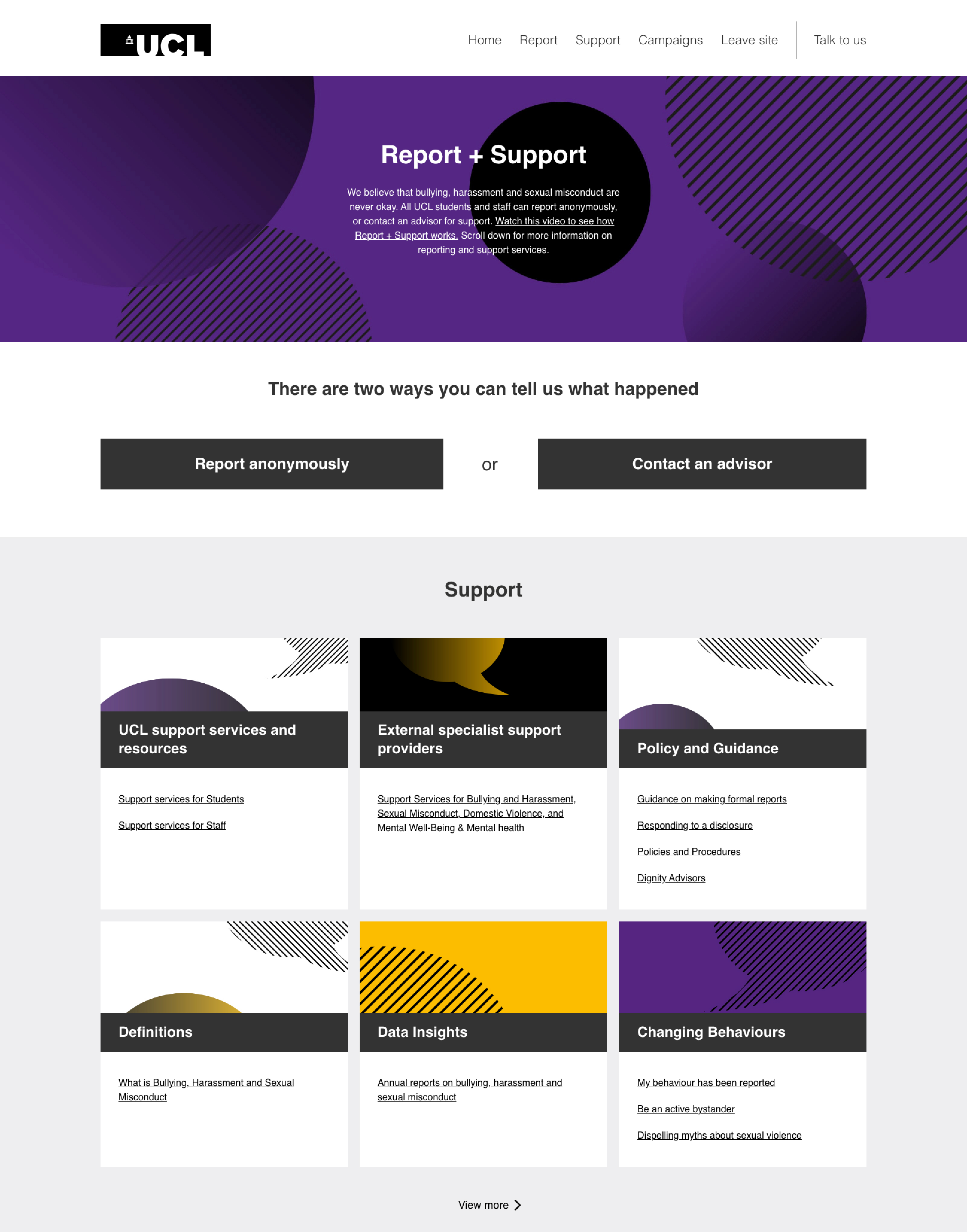
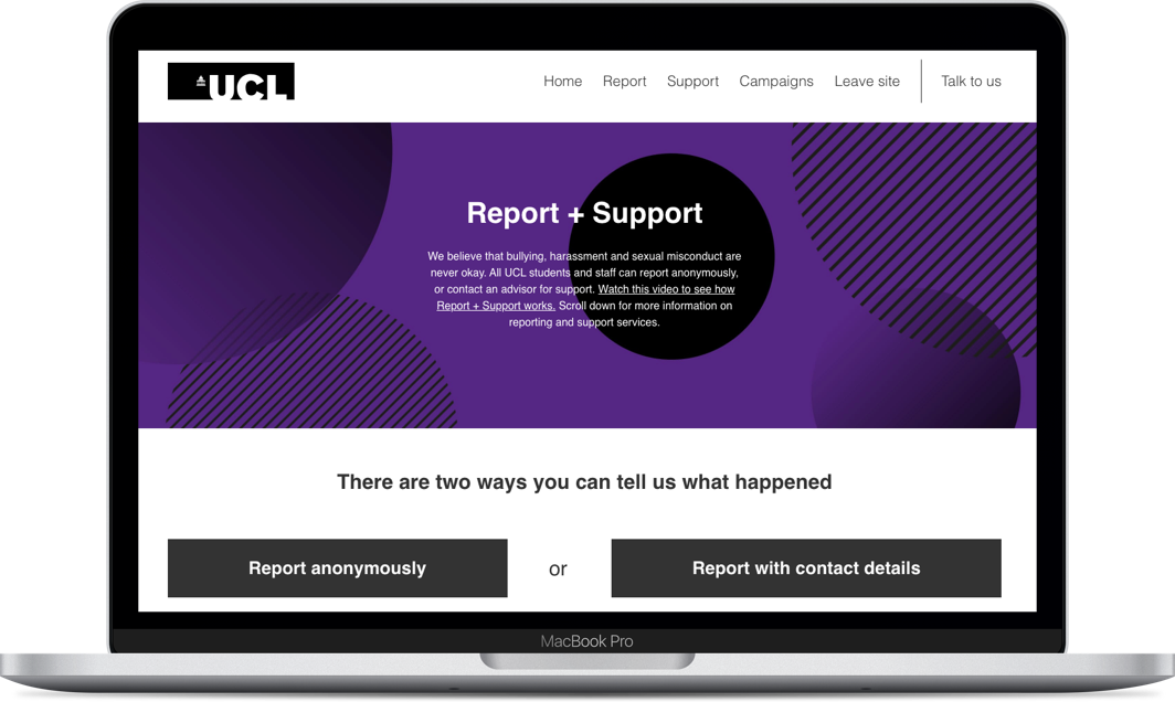
User interface for the Report & Support website (front-end).
Back-End Limitations
- Managing Reports:
- Administrators had to manually remind responders to accept and close reports which was time-consuming and labour-intensive.
- Lots of scrolling is required to extract the relevant information from a report due to the vast amount of fields in the reporting form.
- Managing Pages:
- On the main page, it is difficult to see at a glance which pages are published and which are drafts.
- When writing articles, there is no flexibility to the page layout or options to add in-page links.
- Viewing Analytics
- The analytics tool had limited functionality.
- The analytics tool did not allow restricted access for different users who might not be permitted to view certain sensitive sections of the case management system.
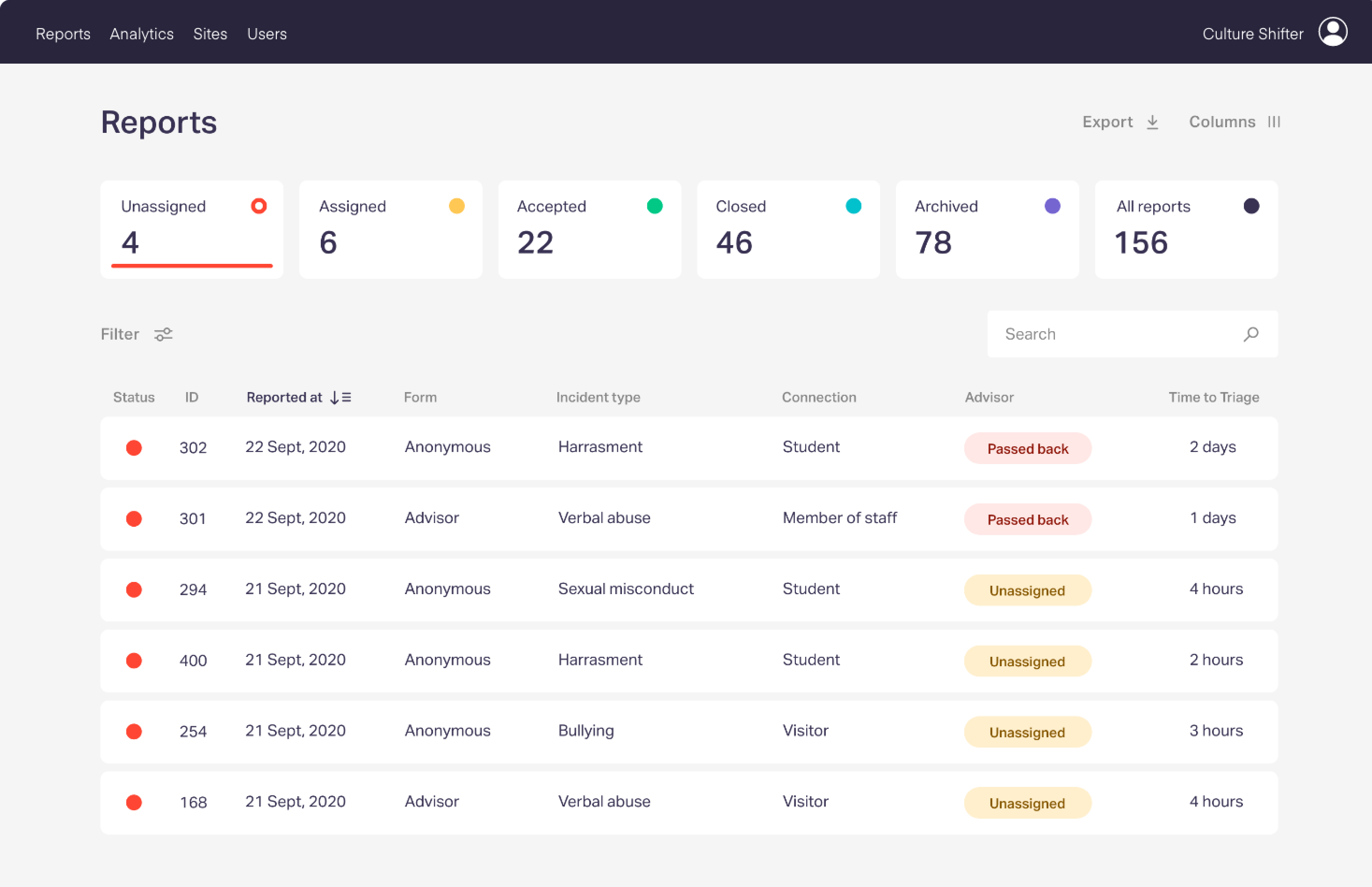
User interface for the case management system (back-end).
3. Ideate
Front-End Recommendations
- Reporting Incidents:
- Provide more information on what users can expect if they report anonymously vs if they provide their contact details.
- Explain complex terms in the reporting form and clarify how their personal data will be used .
- Allow users to jump between different sections of the reporting form.
- Getting Support:
- Categorise the different pages in the Support section based on the four groups that emerged from the open card sort activity: "Reporting Procedure", "Support Services", "Research and Data" and "General Information".
- Rename some of the pages to provide more clarity of their content.
- Split up lengthy articles into multiple shorter articles to improve readability.
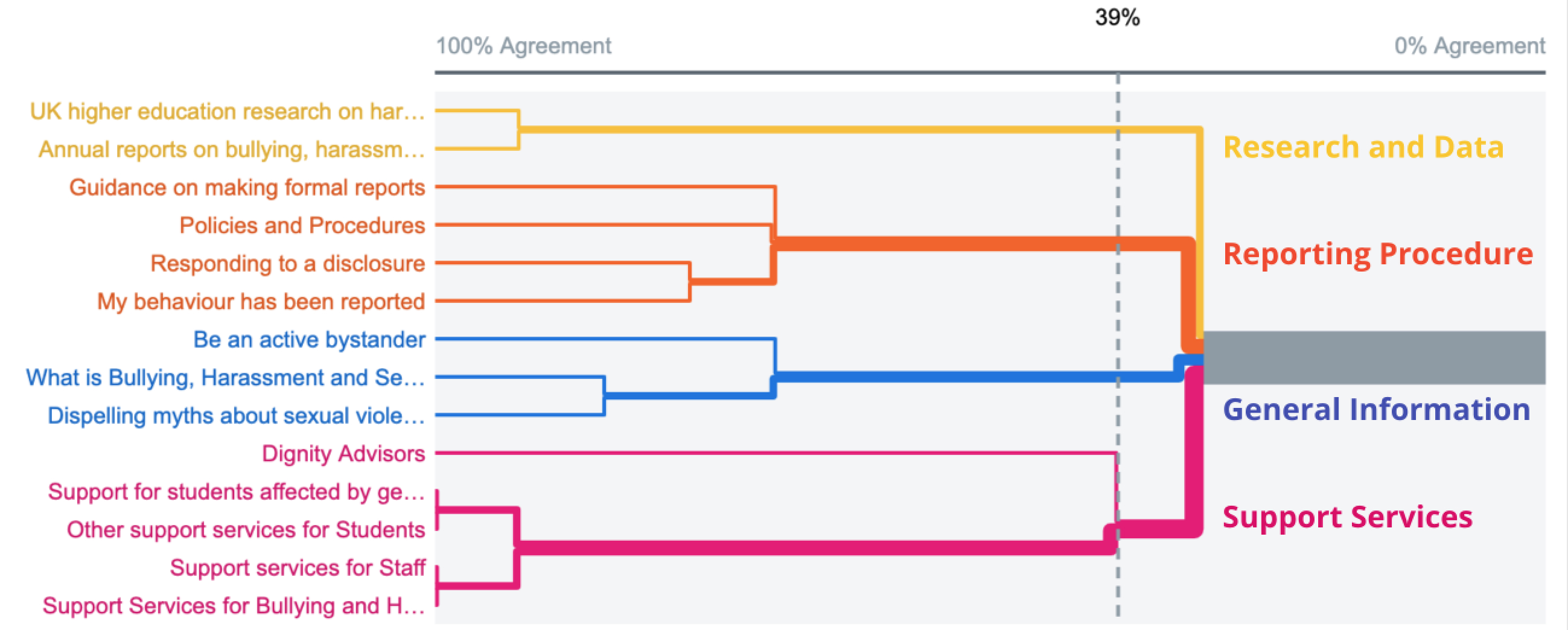
Dendogram showing how pages (left) in the Support Section should be categorised into groups (right).
Back-End Recommendations
- Managing Reports:
- Add automatic notifications to remind responders to accept and close reports.
- Prioritise important information at the top of the report findings, while less important information can be put behind a "more details" button.
- Managing Pages:
- Unpublished drafts should be shown in grey text to differentiate them from published pages (black text).
- There should be features that allow pages to follow a non-linear layout (e.g. CSS grid) and allow in-page links for different sections.
- Viewing Analytics
- The analytics tool should allow users to compare multiple categories and use different channels (e.g. position/colour) to encode the different attributes.
- The analytics tool should allow users to have different levels of permission, so access can be given to a wider range of users without compromising sensitive data.
Results
Outcome
At the end of the project, we produced a research report with detailed descriptions of the research insights and design recommendations.
The Report & Support (R&S) team was very pleased with how the project went and the final deliverables. They published our research report on their website and distributed it to the Equality, Diversity and Inclusion team. They are currently working to implement the design solutions on both the website (front-end) and the case management system (back-end).
"Jingxiu quickly established rapport with users during usability tests and interviews leading to very in-depth insightful data extraction. As the team's manager, I was very impressed with Jingxiu's ability to quickly grasp the needs of the stakeholders and our expectations from project and convert the UX research data into clearly articulated actionable insights that we can follow to improve the platform. The evaluation report was highly praised by senior management at UCL, which, given the rigour of research we do at UCL, is an evidence to his incredible performance. Lastly, this project was a team-project and Jingxiu not only acted as a great team-player but also worked with minimum supervision which in my opinion makes him a great fit in fast-paced work environments. I highly recommend Jingxiu and certain that he will be a great asset to any team he works for."
Nilisha Vashist, Equality, Diversity & Inclusion Manager at UCL (R&S Team Manager)
Reflections
What went well 😄: I ensured that the project progressed smoothly by planning early and preparing contingency measures. Since, this project had a tight 2-month timeline, we recruited a surplus of participants early to reduce the impact of last-minute drop outs, and conducted pilot studies to ensure that our user research sessions proceeded as planned.
What could be improved 🤔: In this project, I went into user research sessions with preconceived expectations of what I might find. As a result, I was surprised by some of the usability issues that emerged during the user research sessions. In future projects, I plan to remind myself to treat users as the experts and reduce my bias toward my own judgments.
Featured Projects

